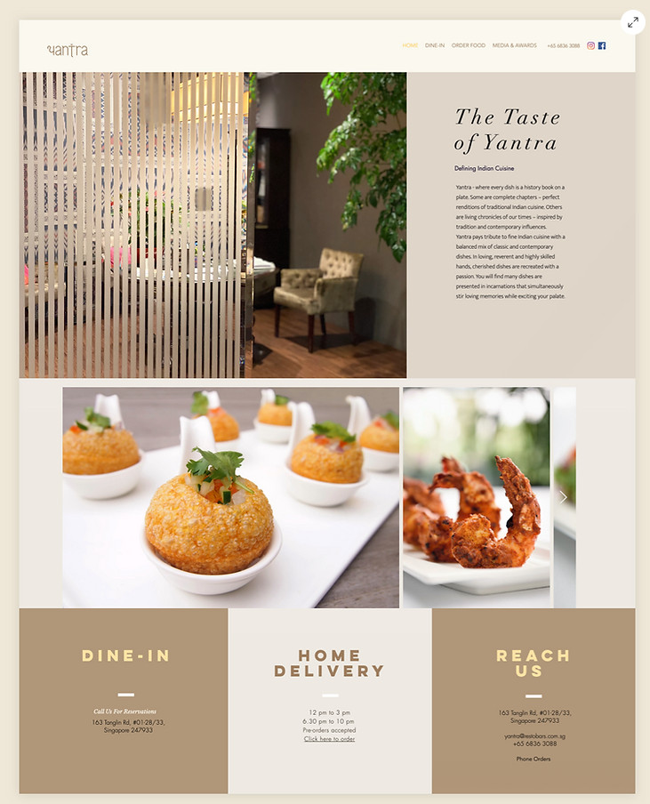
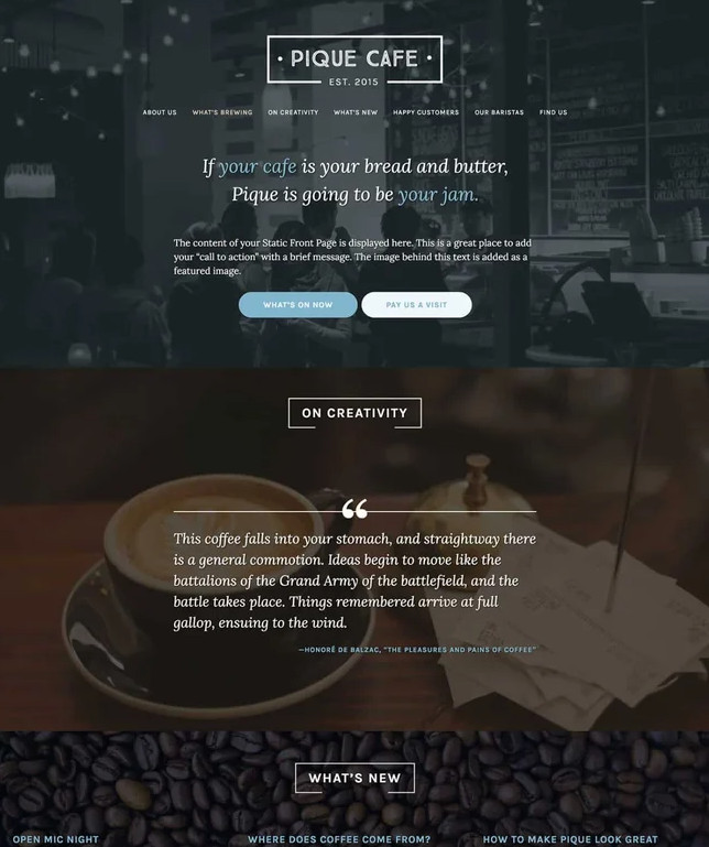
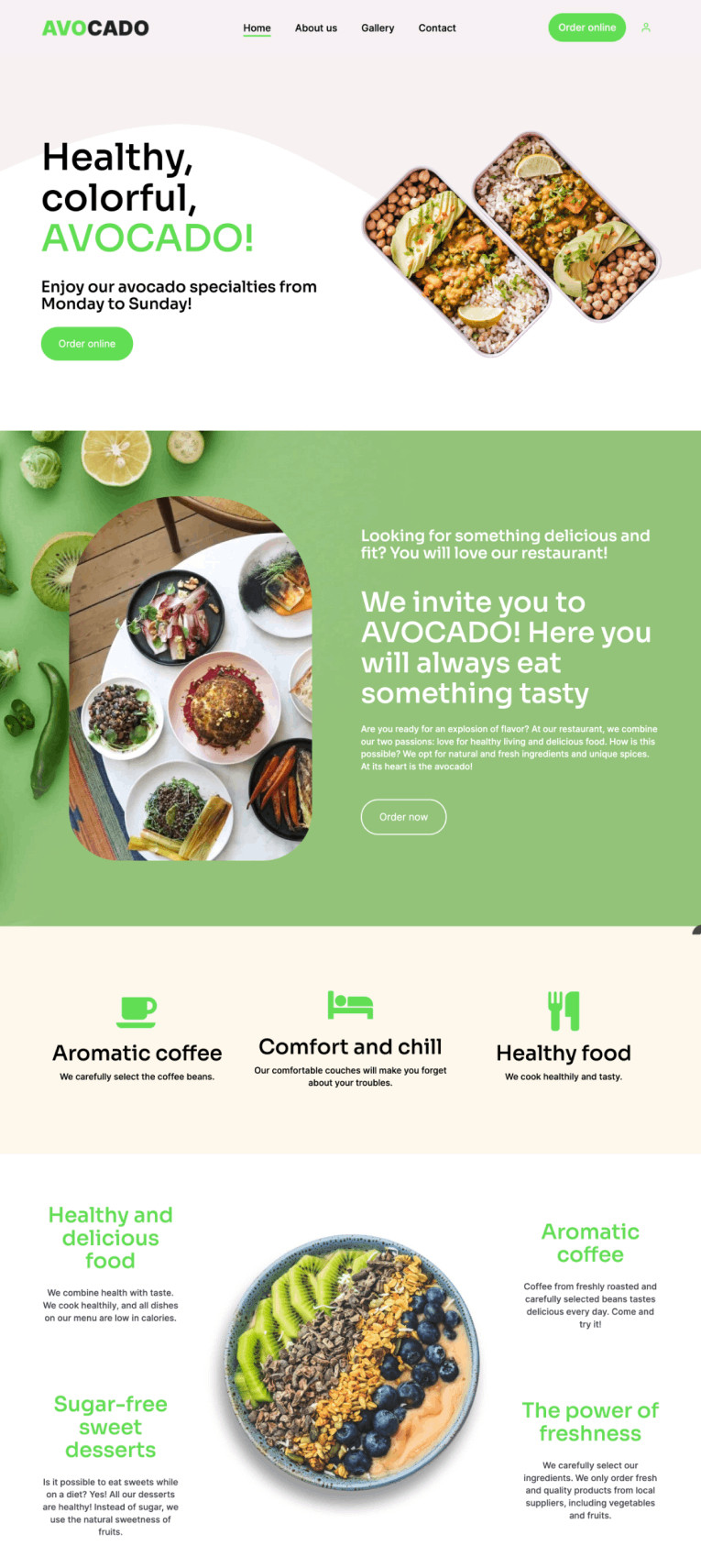
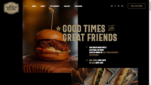
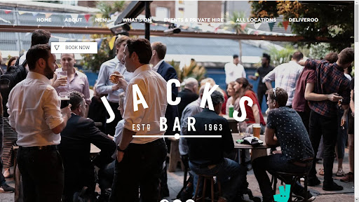
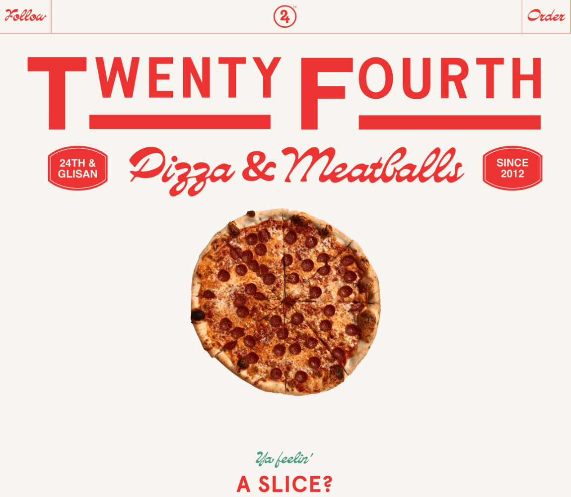
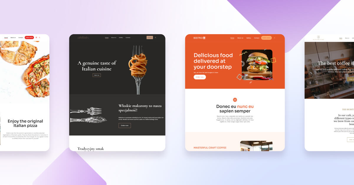
One-page restaurant websites are minimalist websites that offer a captivating and immersive user experience, providing all the essential information about the restaurant without overwhelming visitors with unnecessary clutter.
With striking visuals, a concise menu, easy online ordering for customers, and crucial contact details, best restaurant websites create an enticing virtual experience that mirrors the delight of dining in the restaurant itself. This article will show over 20 examples of the best restaurant website designs. Let’s go for it!
Need help with building new website? Check out our restaurant website development services.
What is a one-page restaurant website?
A one-page restaurant website is a specific type of website that compresses all crucial information about a restaurant into a single, streamlined web page. These websites, known as one-page restaurant websites, adopt a minimalist design approach, incorporating captivating visuals and interactive elements to create an immersive user experience.
Oftentimes, restaurant owners link their website to their Google Business accounts. Potential clients who use search engines to find restaurants often land on Google Maps in search of the business’ physical location. From there, they can hit the link to the restaurant’s website and are taken directly to its home page.
By concisely presenting the menu, location, contact details, and other essential information, these websites offer visitors a quick and straightforward way to explore the restaurant’s offerings and encourage them to make reservations or visit the establishment in person.
What’s the difference between one-page and multi-page restaurant websites?
The main differences between one-page and multi-page restaurant website templates are their structure and content organization.
As the name implies, a one-page restaurant website is designed on a single web page, consolidating all vital restaurant information in one place.
Everything is presented seamlessly on the same page, from the menu and location to contact details, reviews, and other relevant content. Visitors can conveniently scroll down to explore different sections, ensuring a visually engaging and easily navigable experience that is straightforward and concise.
Conversely, a multi-page restaurant website follows a more conventional approach, comprising multiple web pages, each focusing on specific aspects of the restaurant. Typically, these websites include separate pages for the home, menu, about us, contact, reservations, gallery, and other sections.
Visitors navigate between pages by clicking on navigation links or menu options to access different information.
While multi-page websites offer the advantage of accommodating extensive content and improved organization, they may demand more user effort to explore the entire site.
-
Pros of one-page websites
- The loading speed: A one-page restaurant website loads much faster, leading to a higher quality of interaction with the site. Customers generally accept a loading time of up to 2 seconds, and anything longer may result in fewer orders on an online ordering system.
- User-friendly navigation and ease of use: A one-page restaurant website allows users to effortlessly scroll through all the information about a restaurant and its cuisine, providing a comprehensive understanding of their offerings.
- Better conversion for online orders: According to Portent, a website that loads within 1-second experiences a three times higher conversion rate than a site that takes 5 seconds to load.
- Mobile device compatibility: On mobile devices, selecting subsequent sections can be cumbersome for customers. However, a single-page restaurant website eliminates this issue by allowing customers to scroll down and access all the information on a single page.
- Cost-effective development and maintenance: A one-page restaurant website generally incurs lower development and ongoing maintenance costs than multi-page websites.
- Engaging user experience: The visually appealing and immersive design keeps users engaged as they scroll through the content seamlessly. Plus, daily and dinner menus on these websites can be easily viewed.
-
Cons of one-page websites
- Limited content: One-page websites may not effectively accommodate extensive content, given their single-page structure
- Navigation can be challenging: Locating specific information may involve scrolling through the entire page or using anchor links, which could be less intuitive for some users.
- SEO considerations: One-page websites may face challenges ranking for multiple keywords or topics compared to their multi-page sites.
One-page vs. multi-page restaurant website – what’s better?
When it comes to choosing between a one-page and a multi-page restaurant website, it boils down to what fits your specific needs.
If you prefer simplicity and a straightforward approach, choose a one-page website for quick loading and easy navigation. But, if you want more space for detailed content and better search engine visibility, a multi-page website might be the way to go.
Pick the option that best suits your restaurant’s goals and appeals to your target audience.
Do you need to create a restaurant website from scratch?
Check out our ready-to-be-used professional restaurant website templates and read our step-by-step guide on how to build a restaurant website.
Examples of the 21 best one-page restaurant websites
1. Bistro
-
Pros
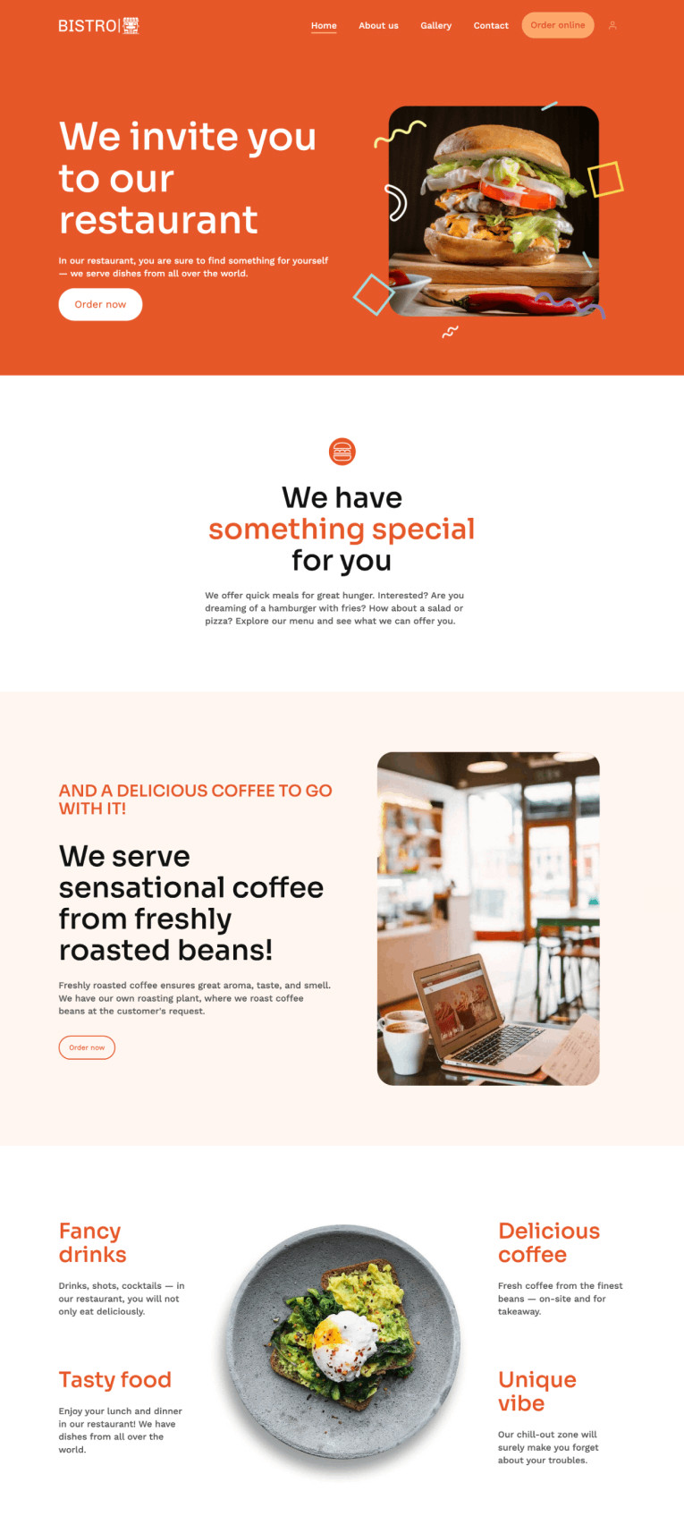
- Professional restaurant template
- Stunning food menu with delicious food photos
- Integrated online ordering system
- Informative "About Us" page with key information
-
Cons
- The lack of a mobile app
- The lack of social media icons
-
Pros
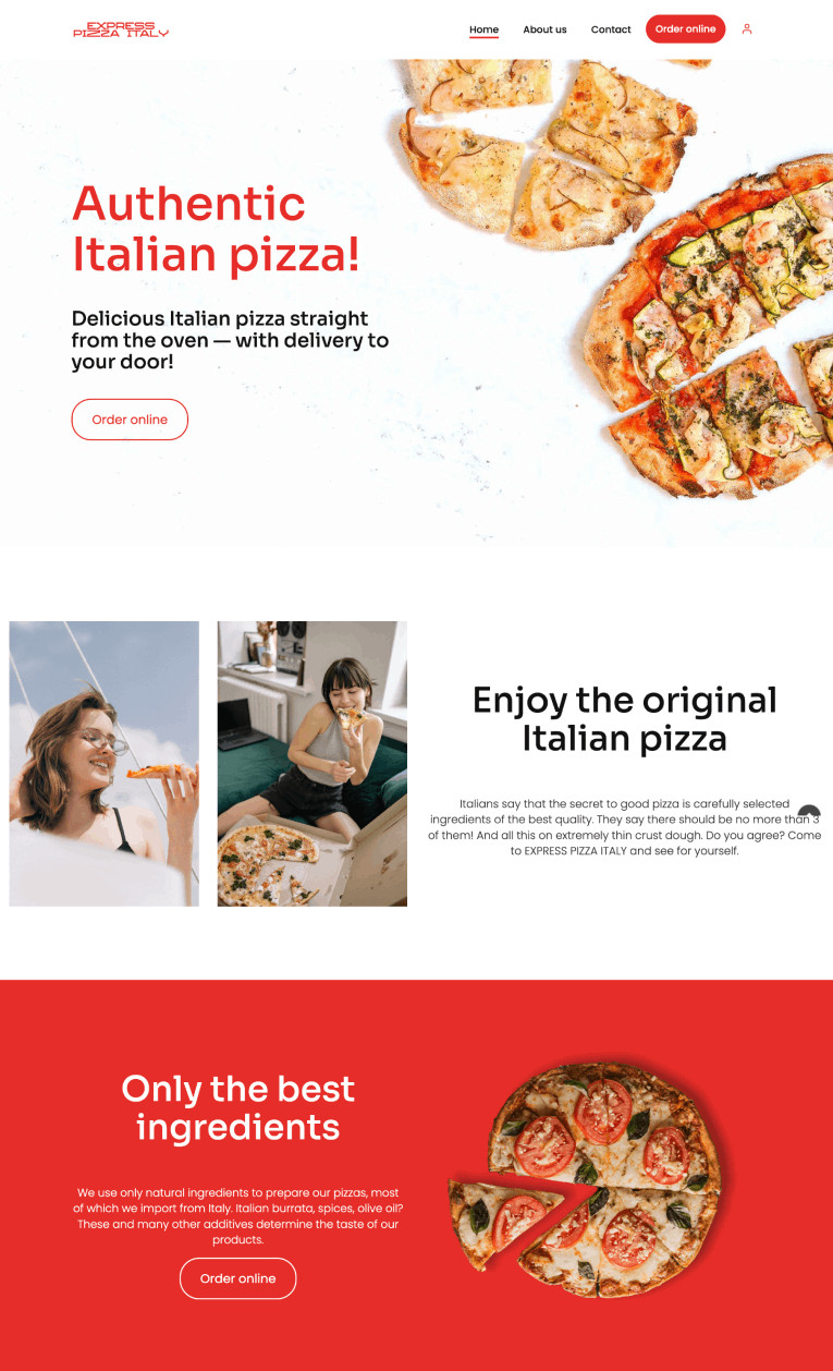
- One of the more creative design examples of a restaurant template
- Built-in online ordering system
- Inviting images to help boost the pizza profit margin
- A great example of a mobile-friendly website
-
Cons
- Lack of information about the loyalty program
- No links to social media
Tip
Build such a website for free with a restaurant website builder.
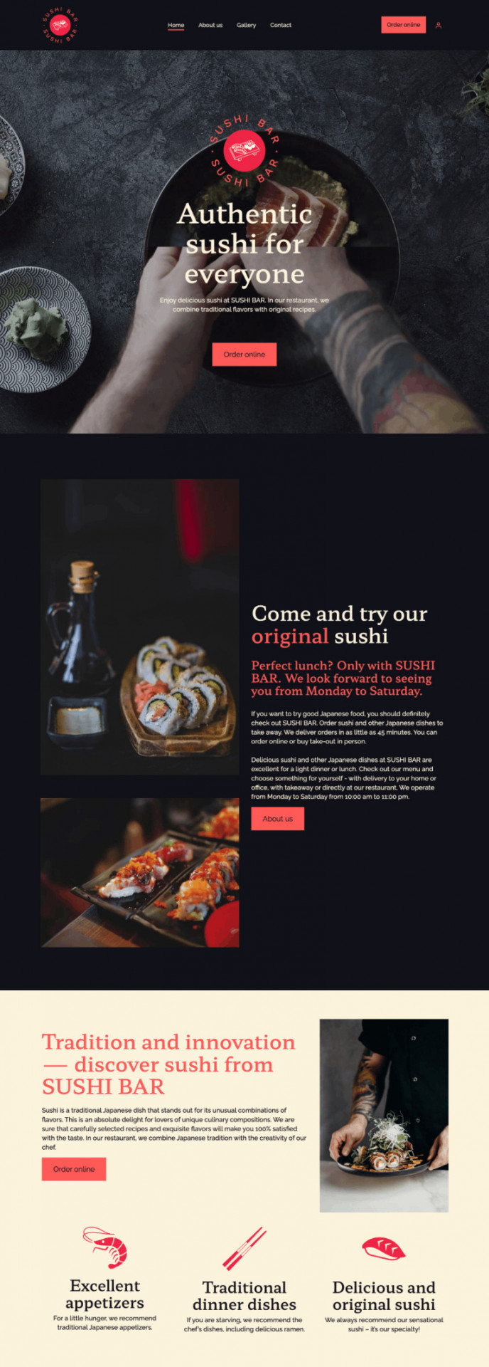
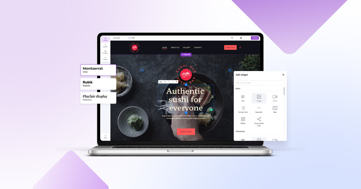
3. Sushi Bar
-
Pros
- Professional restaurant template
- Built-in online ordering system
- Responsive restaurant website design
-
Cons
- Lack of information about the loyalty program
- No links to social media
- The lack of built-in reservations
-
Pros
- Attractive design elements
- Contact info is easy to find
- Website is easy to navigate
- The design is ideal for any food business
-
Cons
- The lack of built-in reservations
- Lack of information about the loyalty program
- No links to social media
-
Pros
- Great photos
- Restaurant menu
- Great home page design
- The option to join a mailing list to learn about special events and promotions
-
Cons
- The lack of built-in reservations
6. Jacks Bar
-
Pros
- Beautifully designed WordPress template
- Good images attract more guests
- The option to make a reservation
- Private dining and events option
-
Cons
- The lack of a restaurant’s own online ordering system
- Lack of information about the loyalty program
-
Pros
- Great photo examples
- Easily accessible restaurant menu
- Multiple locations
- Food delivery integration
-
Cons
- No built-in online food ordering
- No website app
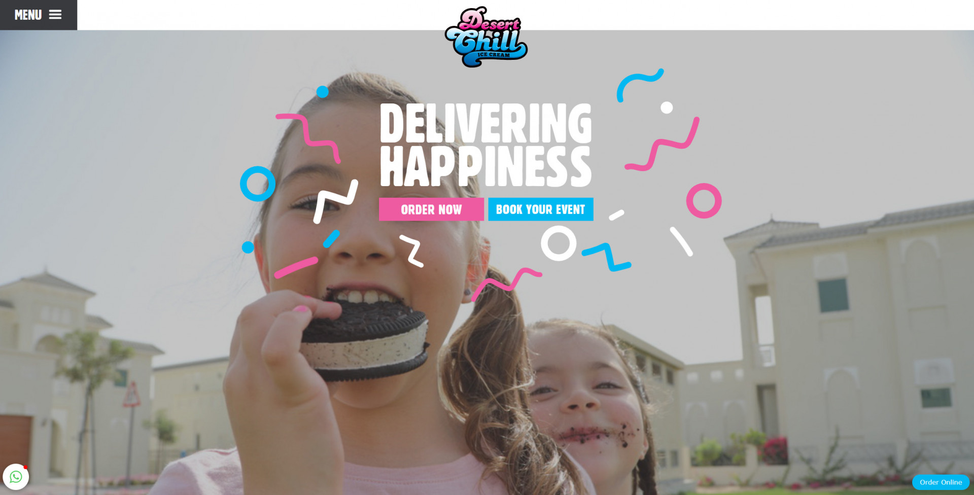
8. Desert Chill
-
Pros
- Attractive design elements
- Contact info is easy to find
- Website is easy to navigate
- Interesting website theme
-
Cons
- The lack of built-in reservations
- Lack of information about the loyalty program
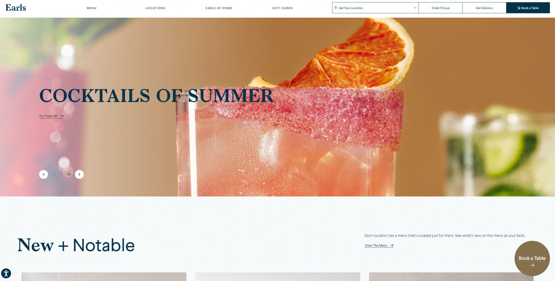
9. Earls
-
Pros
- Great photo options
- Easily accessible restaurant menu
- Great home page design
- A section for special events and promotions
-
Cons
- The lack of built-in reservations
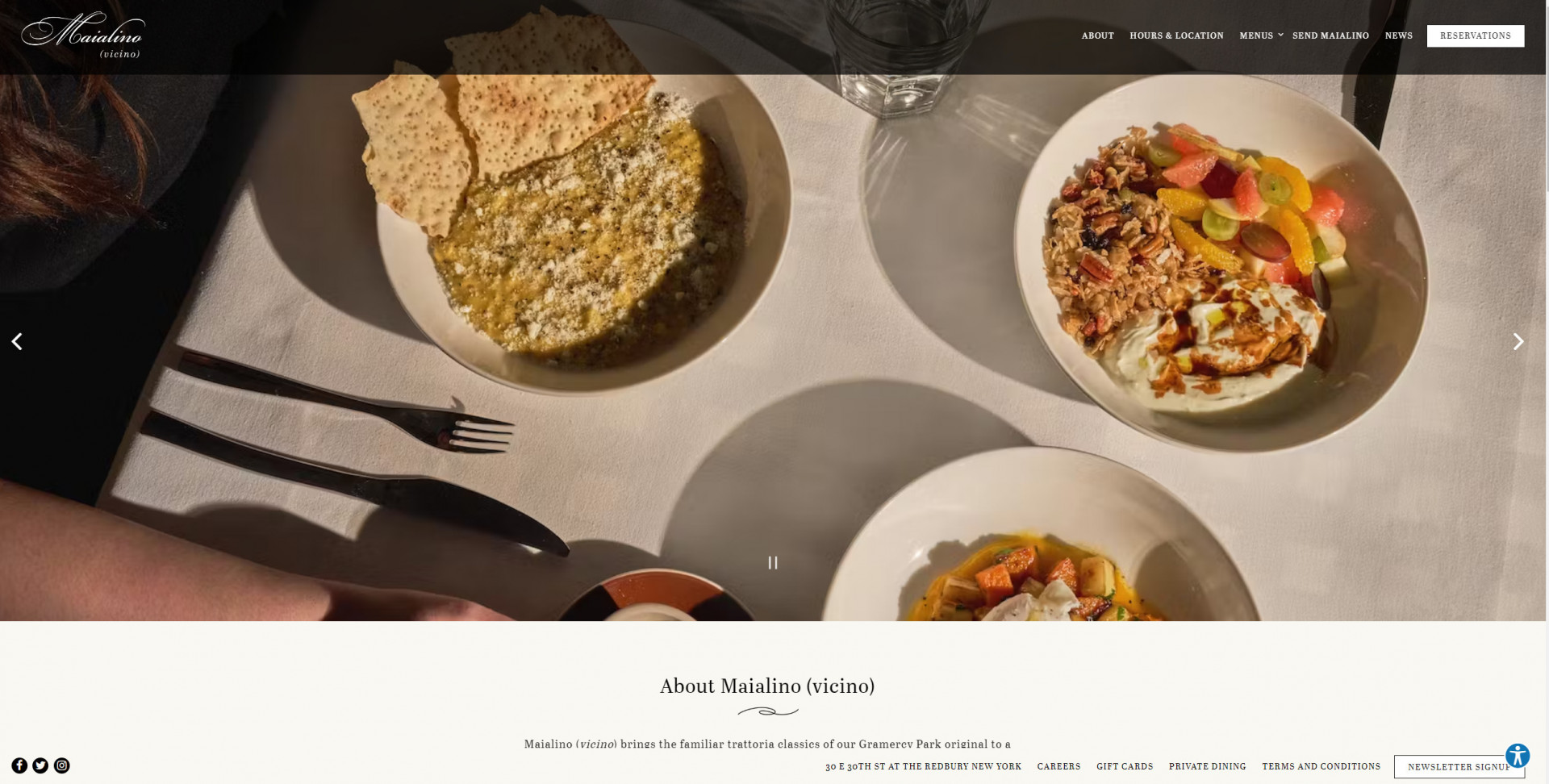
10. Maialino
-
Pros
- Attractive design elements
- Contact info is easy to find
- Website is easy to navigate
- The design is ideal for any food business
- Order pickup, food delivery options
-
Cons
- Lack of information about the loyalty program
-
Pros
- Great photo examples
- Easily accessible restaurant menu
- Multiple locations
- Food delivery integration
-
Cons
- No built-in online food ordering
- No website app
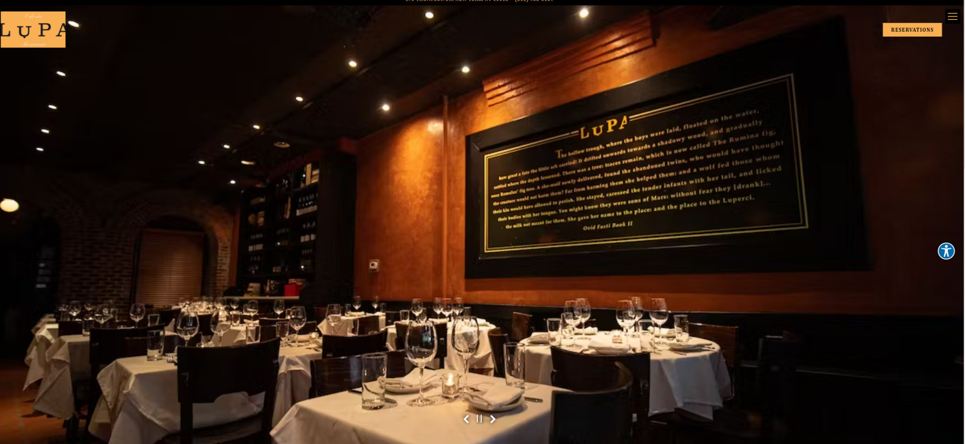
12. Lupa
-
Pros
- Unique design elements
- Contact info is easy to find
- Website is easy to navigate
- The design is ideal for most upscale restaurants
- Food delivery options
-
Cons
- Lack of information about the loyalty program
- No website app
- No dedicated online ordering system
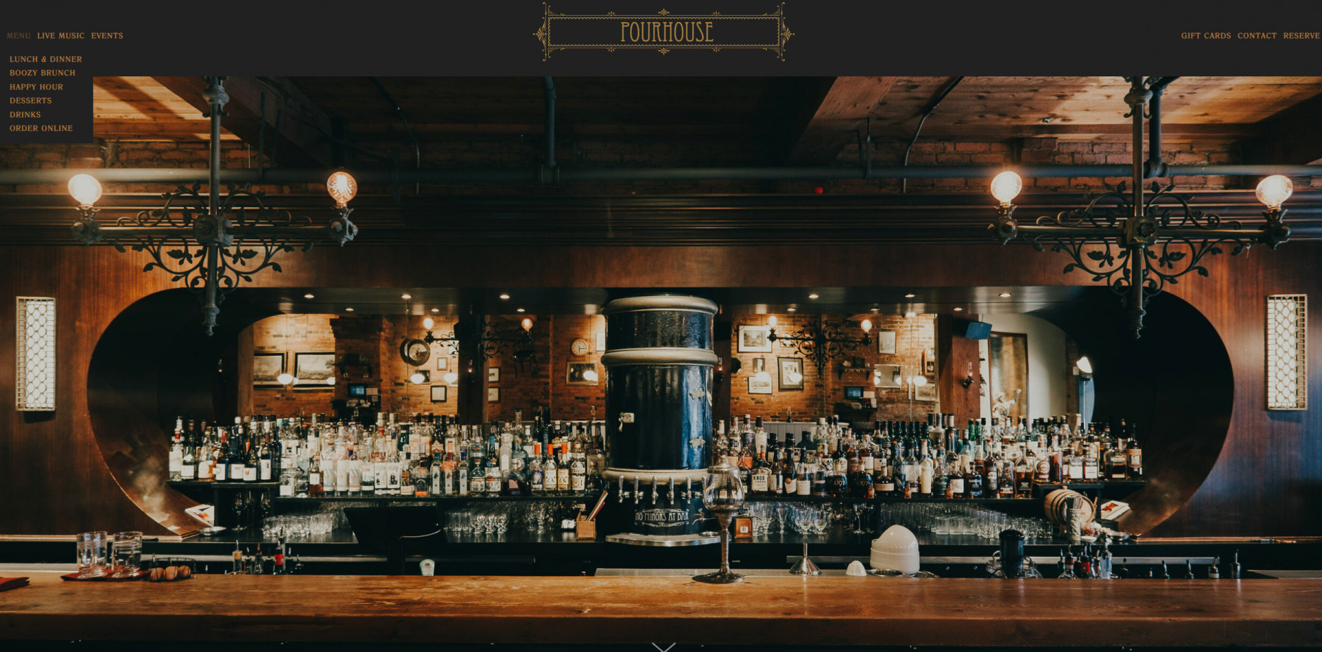
13. Pourhouse
-
Pros
- Attractive design elements for cafes, bars, and pubs
- Contact info is easy to find
- Website is easy to navigate
- Interesting website theme
-
Cons
- The lack of built-in reservations
- Lack of information about the loyalty program
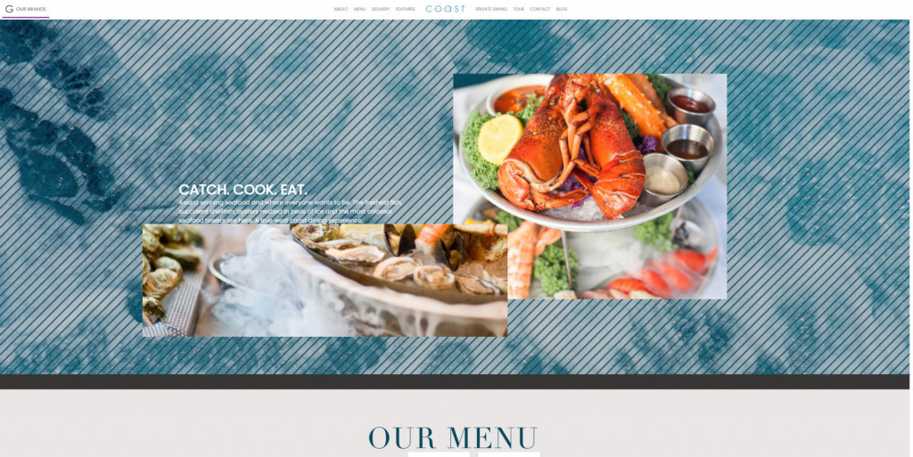
14. Costal
-
Pros
- Attractive design elements for seafood restaurants
- Website is easy to navigate
- Interesting website theme
-
Cons
- Lack of information about the loyalty program
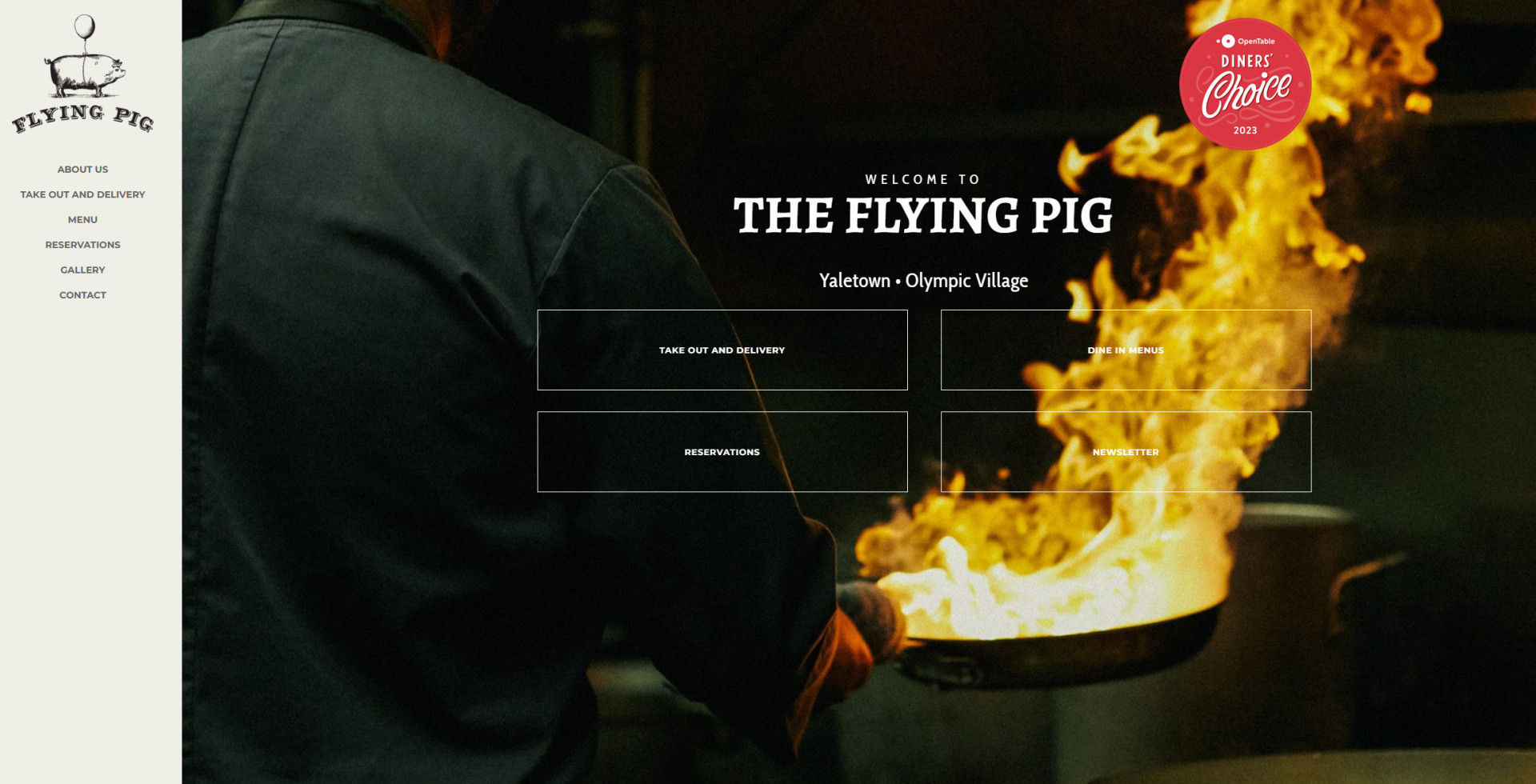
15. The Flying Pig
-
Pros
- Attractive design elements
- Contact info is easy to find
- Website is easy to navigate
- The design is ideal for any food business
-
Cons
- Lack of information about the loyalty program
- No links to social media
- No built in delivery management
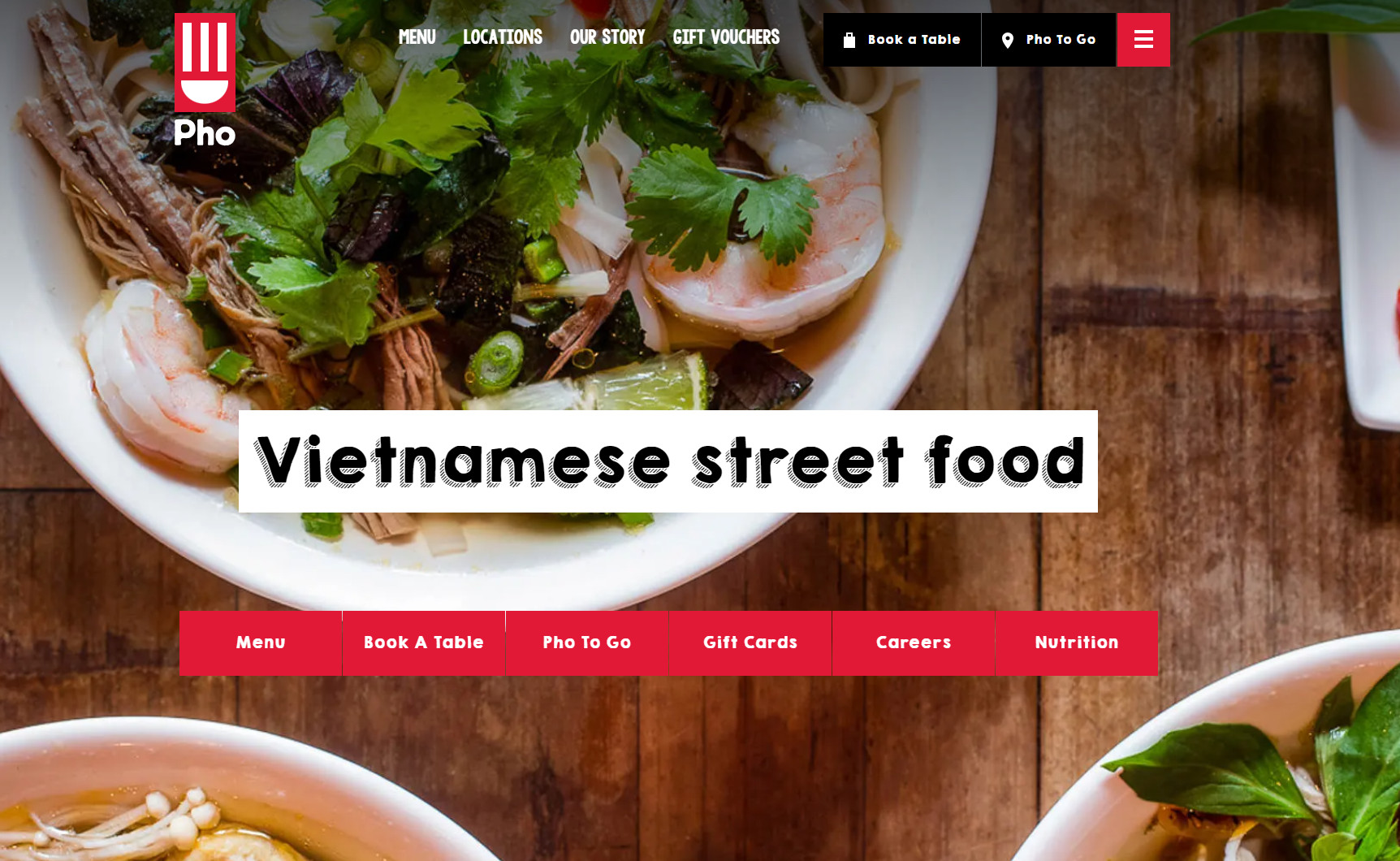
16. Pho
-
Pros
- Attractive design elements for Asian cuisine
- Contact info is easy to find
- Website is easy to navigate
- Gift voucher options
-
Cons
- The lack of built-in reservations
- Lack of information about the loyalty program
17. El Catrin
-
Pros
- Attractive design elements for Mexican restaurants
- Interesting website theme
- Social media links available
-
Cons
- Lack of information about the loyalty program
- Website can be confusing to navigate
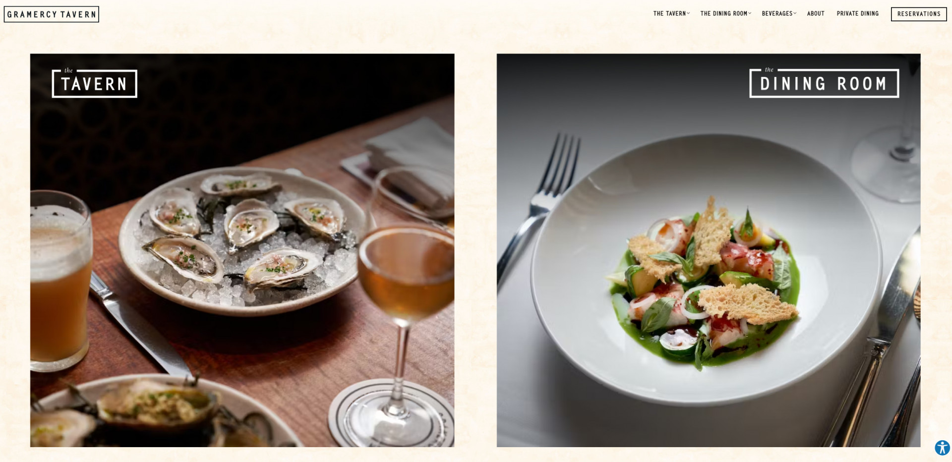
18. Gramercy Tavern
-
Pros
- Attractive design elements
- Restaurant information is easy to find
- Website is easy to navigate
- The design is ideal for any food business
-
Cons
- Lack of information about the loyalty program
- Website feels too simplistic
- No built in delivery management
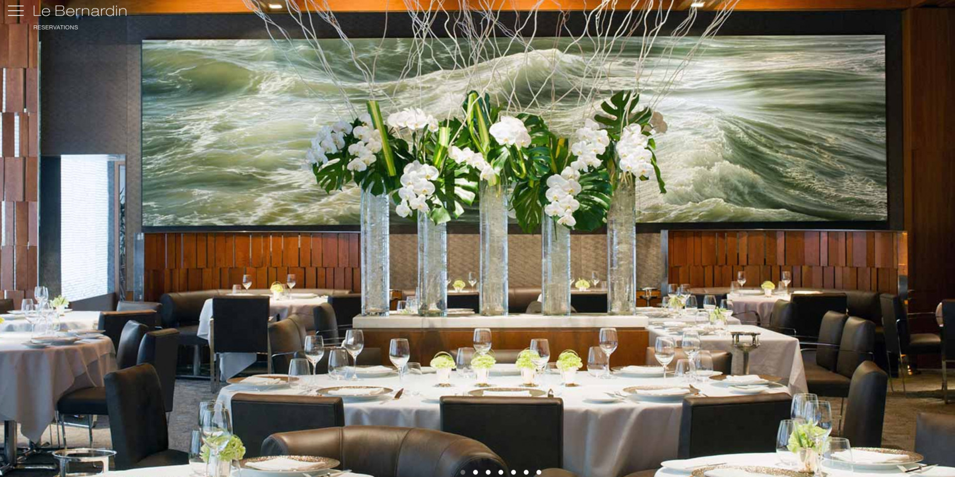
19. Le Bernardin
-
Pros
- Attractive design elements for upscale restaurants
- Website is easy to navigate
- Interesting website theme
-
Cons
- Lack of information about the loyalty program
- Website design might not be suited for all restaurants
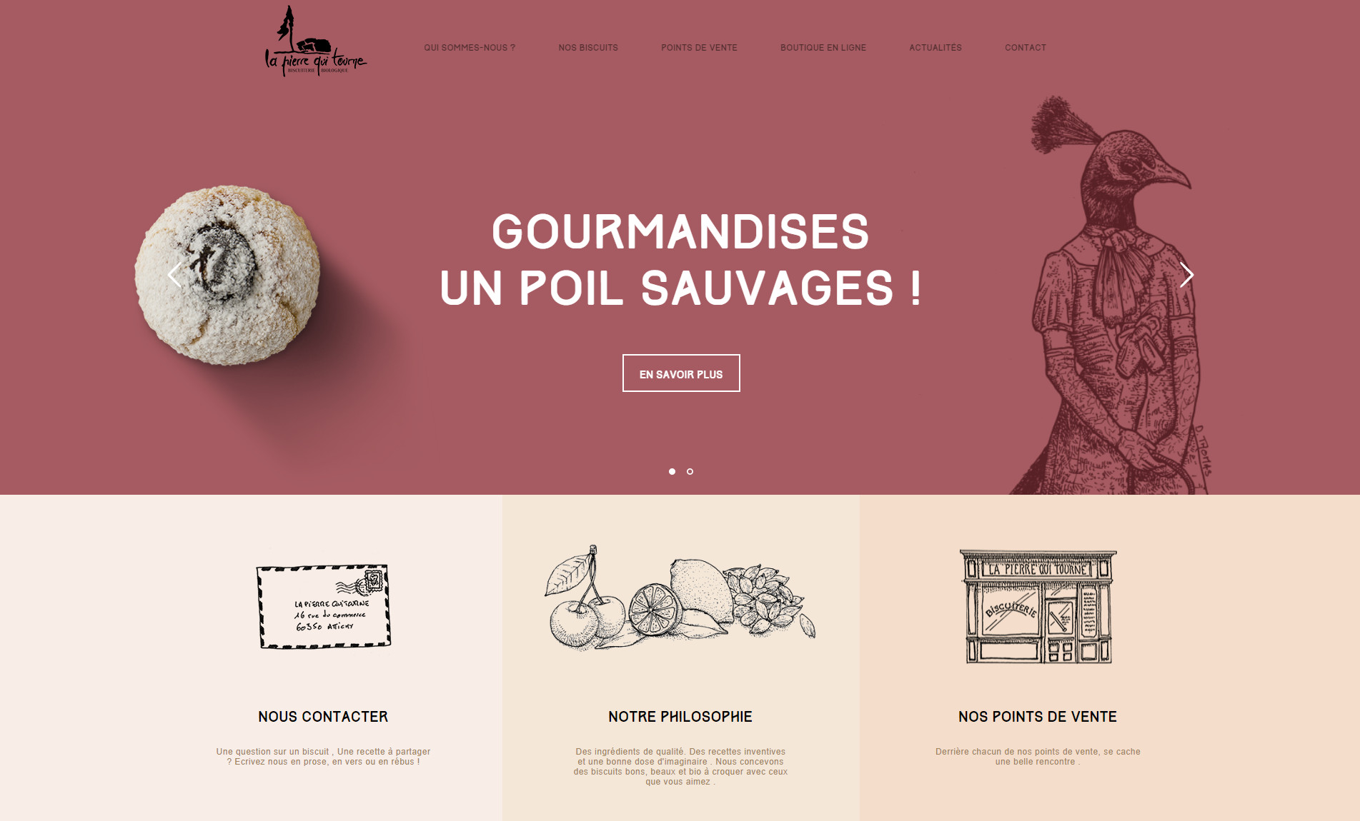
-
Pros
- Attractive design elements for cafes, bistros, pasty shops, and more
- Business info is easy to find
- Website is easy to navigate
- Gift voucher options
-
Cons
- The lack of built-in reservations
- Lack of information about the loyalty program
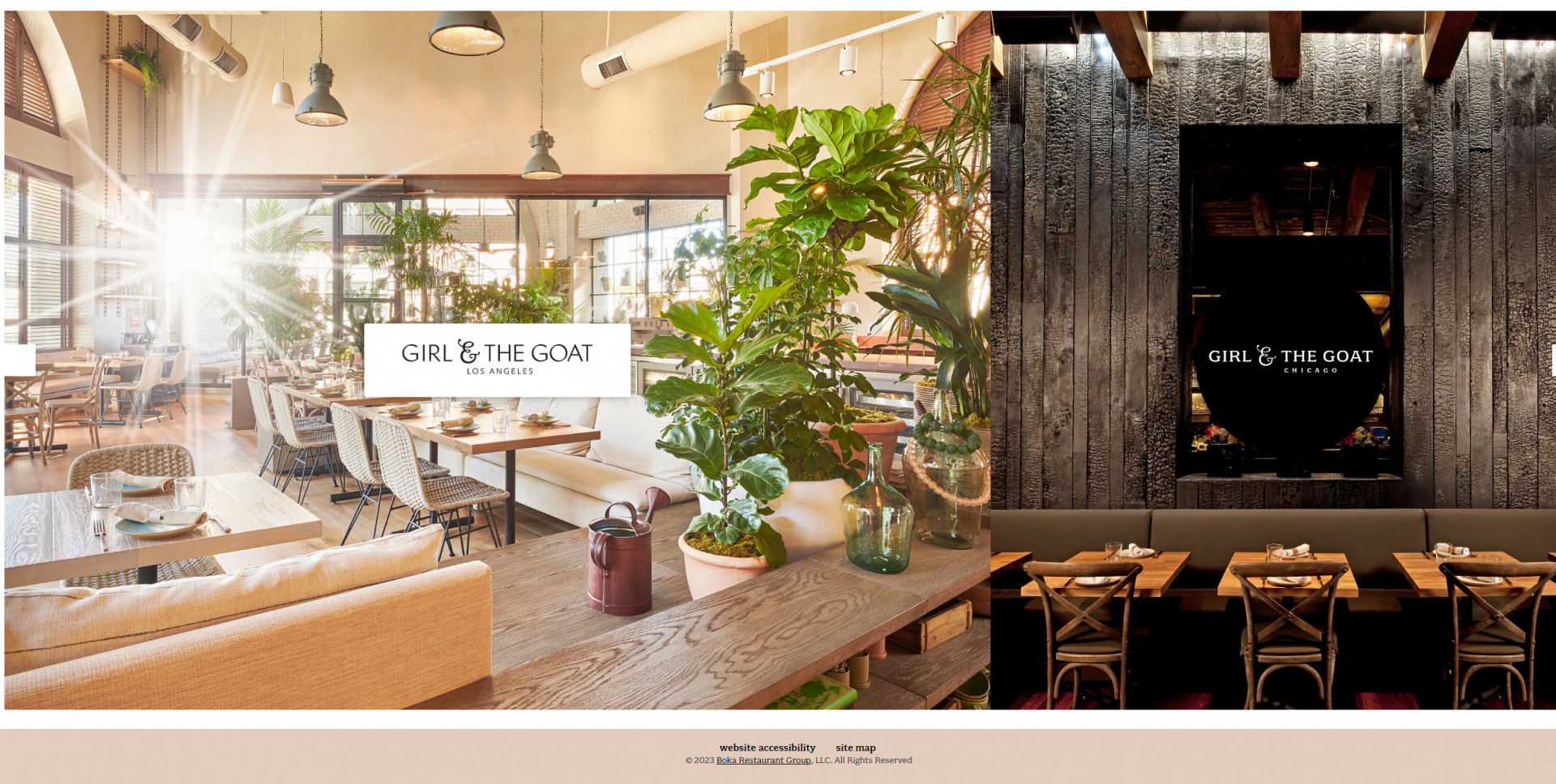
21. Girl & The Goat
-
Pros
- Attractive design elements
- Restaurant information is easy to find
- Website is easy to navigate
- The design is ideal for any food business
-
Cons
- Lack of information about the loyalty program
Key Takeaways
- A one-page restaurant website offers a minimalist design that presents all essential information in a straightforward manner. This simplicity enhances the user experience and makes it easier for visitors to find what they need quickly.
- Restaurant website designs with captivating visuals, interactive elements, and smooth scrolling create a more immersive and engaging experience for visitors, encouraging them to explore the site thoroughly.
- The single-page structure reduces server requests, resulting in faster loading times. This quick response is crucial in keeping visitors engaged and preventing them from bouncing off the site due to slow loading. It also increases the online ordering conversion.
- One-page websites are well-suited for mobile devices, providing a seamless and consistent user experience across different screen sizes.
- The limited space on a one-page website encourages concise and impactful content. By focusing on essential information like the food menu, food delivery service, and restaurant location, restaurants can effectively convey their brand message and offerings to visitors.
Frequently Asked Questions (FAQ)
How do I create a simple restaurant website?
You can use an intuitive restaurant website builder to create a simple restaurant website. You don’t need technical skills, you just simply choose a restaurant template, add your content and high-quality images and customize your website.
In UpMenu, you can choose one of the available restaurant website templates that provide a unique experience.
Check out this article to learn how to create a restaurant website. You can also explore this list of the best restaurant web design companies.
What is a restaurant landing page?
It serves as the initial point of contact for online visitors who are interested in learning more about the restaurant’s offerings, ambiance, location, menu, and other relevant details.
The primary goal of a restaurant landing page is to encourage visitors to take specific actions, such as making a reservation, placing an order for delivery or takeout, or learning more about the restaurant’s services.
Key components of a restaurant landing page typically include:
- Visuals: High-quality images of the restaurant’s interior, exterior, dishes, and drinks to showcase its ambiance and food offerings.
- Menu: A clear and visually appealing menu section that highlights the variety of dishes, including descriptions and prices. Some restaurant landing pages might even offer the option to download a PDF version of the menu.
- Contact Information: Clearly displayed contact details, including the restaurant’s address, phone number, and possibly a map for easy navigation.
- Reservation or Order Button: Prominent buttons or call-to-action (CTA) elements that allow visitors to make reservations, book a table, or place an order for delivery or takeout.
- About Us: A brief description of the restaurant’s history, concept, values, and any unique features that set it apart from others.
- Reviews and Testimonials: Customer reviews, ratings, and testimonials that showcase positive experiences and build credibility.
What is a restaurant website?
A restaurant website is a valuable tool for attracting new customers, providing essential information, and enhancing the overall dining experience. Here are some key features and components commonly found on restaurant websites:
- Homepage: The main landing page of the website, often featuring high-quality images of the restaurant’s interior, exterior, and signature dishes. It usually provides a brief overview of the restaurant’s concept and atmosphere.
- Menu: A dedicated section that showcases the restaurant’s menu, including descriptions, prices, and images of the dishes. Some websites may even include nutritional information or allergy warnings.
- Online Reservations: An integrated reservation system that allows visitors to book a table online for a specific date and time.
- Ordering Options: If applicable, the website might provide options for online ordering, takeout, or delivery services. Customers can select items from the menu and place their orders directly through the website.
- About Us: This section provides information about the restaurant’s history, founders, mission, and any unique features that set it apart from others.
- Contact Information: Clear and updated contact details, including the restaurant’s address, phone number, email, and possibly a map for easy navigation.
- Location and Directions: A map with directions to the restaurant, as well as nearby landmarks or public transportation options.
Why have a restaurant website?
Having a restaurant website offers numerous benefits that can positively impact your restaurant’s success and online presence. Here are some key reasons why having a restaurant website is important:
- Online Visibility: A website makes your restaurant accessible to a global audience 24/7. People searching for dining options can easily find information about your restaurant, regardless of their location or time zone.
- First Impression: Your website serves as a digital storefront, providing a first impression of your restaurant’s ambiance, cuisine, and overall experience. A well-designed website can entice potential customers to visit in person.
- Information Hub: A website is a central place to share essential information about your restaurant, such as menu items, pricing, operating hours, location, contact details, and any special promotions or events.
- Menu Presentation: Displaying your menu online allows customers to explore your offerings before visiting. Detailed descriptions, high-quality images, and potential dietary information can influence their dining decisions.
- Direct Communication: A website enables direct communication with your customers. They can make reservations, place online orders, inquire about events or catering services, and reach out with questions or feedback.
- Search Engine Visibility: Having a website improves your search engine visibility. When people search for restaurants or specific cuisines in their area, a well-optimized website increases the likelihood of your restaurant appearing in search results.
Do I need a restaurant website in 2024?
Yes, having a restaurant website in 2024 is highly beneficial. A website serves as a central platform for customers to find information about your menu, hours, location, and contact details. It also supports online reservations, ordering, and can showcase customer reviews and photos. In today’s digital age, a website significantly enhances your restaurant’s visibility and accessibility. See this article to learn how to create a restaurant website.

